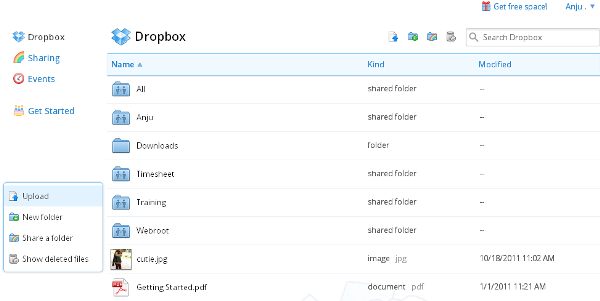
 Dropbox website undergone major design changes with the addition of action bar, photo viewer and new drag and drop and many other features. Anyone who signs into dropbox.com will see a simpler, more powerful, and more beautiful web experience.
- A focus on the stuff you care about: Dropbox has slm down its website and focus on the star of the page: your stuff. Dropbox have put all the tools you need at your fingertips, but only when you need them. The new action bar at the top of the screen does it all. Think of it as a multi-tool that adjusts to your needs. You can use it to sort your files by name, date, size, and type. Or, if you select a file or folder, the bar will change to let you perform a variety of actions on your selection. A new right-click menu includes these actions as well.
- Better photos experience: Dropbox have built in a simple and gorgeous photo viewer that lets you use your entire screen to view your pictures or videos. Dropbox also added thumbnails for image and video files (Photoshop and Illustrator too!) so you can get a preview of your stuff without needing to open or download it. This way, you’ll always know what IMG5083.JPG or final2.PSD actually looks like, and which video to share with grandma.
- Faster, happier, more productive: It’s way faster and easier to get stuff done using the new site. New drag-and-drop makes moving stuff as easy as on your desktop. Dropbox have also replaced the checkboxes on the page with better multiple file selection (click-dragging works!). And for all you power users out there, dropbox have added keyboard shortcuts to make mouseless browsing a breeze — just hit ‘?’ for a full list. The newely leveled up Dropbox search, not only does it live right in the file browser, but it also instantly fetches results as you type.


Be the first to comment