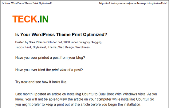
Have you ever printed a post from your blog?
Have you ever tried the print preview of a post?
Try now and see how it looks like.
Last month I posted an article on Installing Ubuntu to Dual Boot With Windows Vista. As you know, you will not be able to view the article on your computer while installing Ubuntu! So you might prefer to keep a print out of the article before you begin the installation.
All blogs have a header, sidebar, and many ads everywhere, even in the middle of the article. Why would you want the unnecessary sidebar and the ads getting printed on a paper? Why don’t we provide a green, eco-friendly printing option? When printing an article, you would just want the heading and contents of the article rather than the advertisements and navigation options.
If we can hide such elements in the theme design for printing a page, we could have a neat print out or PDF version of the article available to everyone. It saves paper, ink, money and the trees!
Are you ready to make your WordPress theme printer friendly? You can apply this in any other website designs as well.
[advt]

First of all, I am not writing anything new. These techniques were there for song long when Stylesheets came into existence. But I don’t see most of the popular blog designs do not consider this factor in their design, or while selecting a theme for their blog.
Style sheets can be defined to specify how an HTML page is to be presented on different media like on the screen, on paper, with a speech synthesizer, with a braille device, etc. You can define different stylesheets for each media. In the header, you can define and link the style sheet to each the media, the example below.
<link rel=”stylesheet” href=”style.css” type=”text/css” />
<link rel=”stylesheet” href=”style.css” type=”text/css” media=”screen” />
<link rel=”stylesheet” href=”print.css” type=”text/css” media=”print” />
<link rel=”stylesheet” href=”handheld.css” type=”text/css” media=”handheld” />
If the media property is not specified, it is applicable to all.
Another simple option is to use the @media rule in the same style sheet.
@media print {
}
You can define any print specific style sheets within this rule.
AT TECK.IN, I use the second option.
All the styles defined in the style.css will remain same for all media, as long as you don’t attach the media tag in the reference. I hide the unwanted HTML elements like Google ads, sidebar, etc. in the print using the style display:none;
At the end of the theme’s style.css, I defined special style sheet instructions for print. I made the fixed theme into 100% width body and content column, which is good for printing. Also increased the font size and aligned the header and text to the left. Then I selected not to display the other elements by adding display:none; property. That’s it, my theme is printer friendly! You may use the below print media style I used for TECK.IN as a reference.
/***** PRINT CSS *****/
@media print {
body {
margin: 0 auto;
width: 100%;
padding: 0;
border: 0;
color: #000;
background-color: #fff;
font-size: 100%;
font-family: Arial, Verdana, Sans-Serif;
}
div.fixed {
width: 100% !important;
}
#main p, #header, #heading {
text-align: left;
}
#columnA {
width: 100%;
border: 0;
}
#main .commentlist, .commentsblock {
border: 0;
}
a:link, a:visited {
color: #000;
}
#heading h2, #menu, #sidebar, #footer, #relatedposts, #menu-adlinks, .commentbox, .googleads{
display: none;
}
}
I have not defined any specific style for the handheld. I am not sure yet whether it is needed anymore. iPhones and other new generations phones can now view the website as it is. Then, why would we need to strip down any functionality?
What do you think of the print customization of the theme? Are you convinced to have a better print stylesheet for your blog?


Be the first to comment