![]() This is a quick review of the Infosys Technologies website (www.infosys.com). I just had an overall look at the site, did not spend much time. Given below are some suggestions for improvement of the site. BTW, I am planning to redesign Ananthapuri.com homepage, this review might remind me of the design fundamentals.
This is a quick review of the Infosys Technologies website (www.infosys.com). I just had an overall look at the site, did not spend much time. Given below are some suggestions for improvement of the site. BTW, I am planning to redesign Ananthapuri.com homepage, this review might remind me of the design fundamentals.
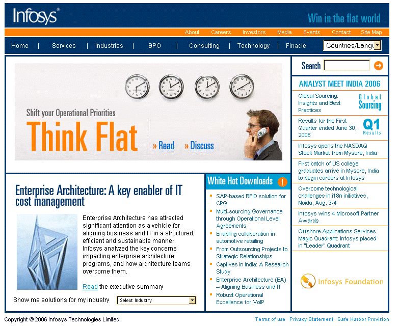

Click to enlarge the pictures
- Infosys Brand Color (sky blue?) of Infosys Logo is not used anywhere in the website.

[fblike]
Examples are Microsoft blue and Oracle red.
- Using the same color scheme/theme in the website layout will give a nice look and branding. Should have lovely color scheme, which is warm and inviting. Selecting such colors will help immediate recognition of the site’s identity. The colors should be appealing to eyes, enhance readability and printable in gray scale or true color.
- Use favorite icon (favicon.ico) for the Infy websites. May be the text INFY in sky blue looks good.
- Home link in the top horizontal menu is not required. The logo on the left-top corner should take the user to homepage. That is the Internet standard.
- Please avoid click here links. For example, “To know more about the benefits that Infosys’ IDI solution offers, click here” can be reworded to Know more about the benefits that Infosys’ IDI solution offers’.
- Current webpage layout has a lot of thick boxes and lines. This does not provide a professional appeal. Please use the boxes and lines only if necessary. By arranging the content using TABLEs, you can give the boxed look to the page, but thick borders kill the UI. Use lighter colors like SILVER and GREY for boxes and lines. Use thin lines and boxes if found absolutely necessary. With XHTML and CSS, it is suggested not to use tables, instead apply CSS positioning of the elements.
- It might look better if the pages (or content management system template if implemented) are designed to use fixed percentage width (say 90% of the screen width) instead of fixed pixel width (750 px). Center aligning the pages might look better and professional. Screen resolution – Optimize pages for 1024×768, use a floating layout to work from 800×600 to 1280×1024. Do not design solely for a specific monitor size.
- Three Column Layouts does not look good, especially for the articles. In most cases, there is not much content in right column. If there is anything like Related Articles, etc. could be given embedded within the text. Three column layouts are generally used by portals and newspapers to display advertisements.
- Industries and Services menus are present in the top horizontal navigation bar, so it is not required as HTML dropdowns on the left column. It is redundant and confusing.
- It would be nice to indicate submenus by using a down arrow in top horizontal navigation bar.
- Copyright statement does not need the word copy right. ©Infosys Technologies Limited is good enough.
- Terms of Use, Privacy and Safe Harbor pages need not open in new browser windows. These pages are integral part of a professional website and can be displayed in the main window itself. The look & feel of these pages should be consistent with the site template.
- Link color, visited link color, hover link color, active link color, underlining and overlining attributes should be defined globally in the CSS and used everywhere for consistency. Currently the link color is lighter than the text color and makes it difficult to read. This is not preferred.
- In You are here (breadcrumb), the text and link are having the same color. LINK color should be consistent across the site.
- The country/language dropdown could also be of the same style as the top navigation bar items and may be renamed as worldwide. Selecting a country from the dropdown just displays Infosys offices in that country, which is basically the contact informamtion. It does not really mean a country specific website. So the link is best described as Worldwide Contact Info and can best go into Contact Us page or Worldwide page.
- I changed the language to Japanese from English. Now I do not see any option to change it back to English. I have to change the URI itself! Also, it seems a content management system is not used for different languages. It seems each language specific webpage is maintained separately. Though it is costly, it is advised to have a synchronized website for all languages, with the best CMS and a team in place.
- Go button in search page and in right corner of other pages are different. It is suggested to use the image consistently. Search button is better than a Go button.
- Use some inviting style sheet to display the search box (textbox).
- Where can I find Infosys Vision and mission statement in the website?
- Where in the website can I see the Infosys motto, ‘Powered by Intellect, Driven by Values’? Or is it changed to ‘Improve Your Odds with Infosys predictability’ or ‘Win in the flat world’, as seen in some pages?
- Check for search engine optimization settings for all pages.
- Redesign the site with latest XHTML, CSS, AJAX and othe Web 2.0 technologies for better viewing, increased performance and easy maintenance.
- SUMMARY tag is missing in all tables. The site does not confirm to any HTML/XHTML standards.
- It is advisable to include Accessibility standards in the site.
- For checkboxes, make the checkbox label also clickable (using label tag and for attribute).
- In Contacts page, I would suggest not using JavaScript popup windows. This may not work if popup blocker software is installed. Listing the locations and addresses grouped together in one or many pages could be better than this.
- For other download documents like PDF, Word, etc, indicate them using icons. For the downloads, display the size of the document also.
- For events, give an Outlook calendar icon and allow the user to click and add the event to their Outlook Calendar (iCalendar).
- Change MUST READ! to Related Articles or Related Papers.
- The testimony yellow box on the left side column seems inappropriate for a big global IT player like Infosys. Any important testimony or remarks on Infosys can be placed in the Infosys in News section, or create a separate testimony page.
- The Dark blue color in the master head does not look good for a corporate website. Lighter colors are better.
- Tool tips and Status Bar tips may be provided for the menu items.
- MUST READ!, testimony and the left vertical menu are within the left or right columns. These sub items are again put into boxes. More space is wasted in the column by not integrating them well. It is suggested to show only a smaller box again within the left/right column box. These boxes unnecessarily eat up space in web page and make it look ugly.
- A lot of style sheets are used across all pages (infosysGlobal.css, navigbar.css, footer.css, search.css, leftColumn.css , demoinside3.css). These could be combined into a single file. This reduces overhead on the server and the browser.
- <meta name=”page_rank” content=”100″> tag is found to be used, which has no meaning in Search Engine Optimization.
- Inline style sheets are also used in some cases. It is suggested to move those styles into the common css file, for caching and improved performance.
- The CSS and JavaScript files can be optimized to remove comments, etc. to reduce file size and hence performance.
- It will be ideal to host regional websites in their own domain like, Infosys.jp for Japan, Infosys.cn for China, etc.
- PDF is not suggested for presenting online reading. Visitors get lost inside PDF files, which are typically big, linear text blobs that are optimized for print and unpleasant to read and navigate online. PDF is good for printing, and not for online presentation. Provide the articles in HTML format for online reading and PDF for printing/downloading.
- Involve external consultants like Human Factors if necessary for more complex usability study and suggestions.
I sent these observations to Infosys.com Website Feedback too. Hope this helps.

Be the first to comment