 Google revamped the mobile version of its Gmail which gives the Gmail mobile a fresh look and feel especially on smaller screens. Google did this with the use of eight different CSS3 transitions and JavaScript. The new gmail mobile looks like an installed app.
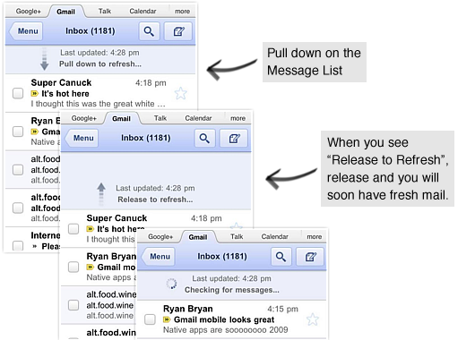
Email messages can now be manually refreshed with a down pull- a feature similar to Twitter’s own drag-down approach. Gmail team modified the inbox navigation with new sliding transitions, and enlarged the graphical interface, taking full advantage of that Retina Display.

The changes introduced in Gmail mobile are the following:
- Pull down to refresh: You can now pull down to refresh your message list and conversation on all iOS and Playbook devices. To refresh, simply touch the message list, drag downwards and release.
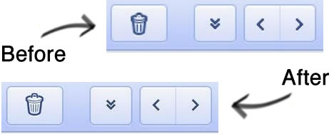
- High resolution icons: For those of you using Gmail for mobile on an iPhone 4 Retina display, the icons and graphics are now at a higher resolution, making Gmail for mobile sharper.
- Transitions: When you tap on a conversation, tap back to the inbox, go to the menu or go back, the view will slide left or right. This new transition animation is a quick, small indication that makes the view change feel smoother.


Be the first to comment